Marina Tkhorzhevskaia
Graphic & Editorial Design


und wein
Art Direction
Packaging Design
Digital Design
Naming
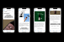
This project was developed for a young Berlin-based winery launching a small family of two red wines, each aged differently.
Wine drinking is an inherently social ritual — it enhances shared experiences and fosters emotional connections between people. A bottle of wine becomes part of this togetherness, an intangible “heritage” passed from one person to another as stories and memories are exchanged around the table. From this idea came the concept of creating patterns from real hand and fingerprint impressions collected during a home-cooked dinner with friends. These impressions symbolize the “traces” people leave on a wine bottle and the emotional legacy passed quite literally from hand to hand. They can also be seen as a metaphor for the wine’s journey from the producer to the consumer. From the many handprints created, two visual styles were chosen: bold, expressive strokes for the mature wine, and lighter, more delicate strokes for the younger one.
The name und wein was inspired by everyday conversations in cafés and restaurants. It sounds like a natural continuation of an order, suggesting that wine is part of the whole experience rather than standing apart. The handwritten wordmark adds a warm, human touch to the identity.
Calligraphy by Evgeny Tkhorzhevsky
Labels printed on Meta Rough Air 90g
2023